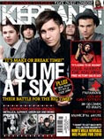
Front Cover
Colour scheme: In terms of the colour scheme the editor has chosen
basic bold colours but in which still draw the audiences attention to the magazine. The colours are very simple yet create meaning in terms of their connotations and attract the target audience the magazine is intented at. The magazine has a quite dark look to it in terms of the use of black in which we can see to be the main choice of colour through the front cover even through what 'You me at six' have on, in their choice of wardrobe. The use of black enhances the other colours used on the magazine for example in reflection with the yellow. The basic reason for the use of these perticular colours are simple because they symbolically mean power,strength,energy ect. Which ironically symolises the target audience of young adults.
Photography: Their is a exessive amount of images on the front of the magazine which consist
of fairly small ones of 'Rage against the machine' to the main one of 'You me at six'
which indicate to us what is the contents of the magazine and what the target audience are to expect within the magazine. The images on the front are all of a mid-shot close up ratio and come across to being quite posed and studio based which adds intenstity and a sense of seriousness to the magazine, rather than the expected more relaxed live shots which we are more than likely to see on the front of kerrang. The style of the photographs are in relation to the topic of the articles within the magazine meaning they symbolise the mood or seriousness of what is to be expected within the magazine.
Fonts: The text on the front of the magazine is in CAPITALS which captures the audience attention and almost indicates the loudness of the magazine. As you can see from the image on the top the magazine name has a cracked effect running through it which indicates a fairly edgey content within the magazine. Noticeably, some of the writing looks as if it has been hand written which shows us as the audience the relaxed atmosphere which is achieved throughout this magazine.
Writing Style: The front cover doesn't hold alot of writing and the little bit it does indicates to the audience what the magazine has inside within it's content. Below the main image of 'You me at six' there is a use of a quote from the bands drummer Dan Flint which highlights the intensisty,the hard work and often the unstability of been in a band. The magazine isn't that formal and is fairly brief in terms of what is written on the front cover which is expected for alternate/rock magazine and the use of slang language symbolises the target audience.
Overall Look: The overall look of the magazine is exciting and there is lot's going on which indicates the business of the industry and draws the target audience in. The way in which the magazine is presented is intresting as it doesn't have a straight on basic layout. There is alot of over lapping and illustrations increase the visual status of the magazine, increasing the likely hood of selling.
Text/picture ratio: On the front cover alone there is more writing than images. I believe this is because the front cover being a huge selling point, offers the chance to advertise special offers to persuade the target audience to buy the magazine, they do this by highlighting key features which will be the magazine and use quotes so the audience becomes interested to what there favourite bands have to say, fans then can relate and become more interested gathering a sense of envolvenment and can relate to the bands.
Publisher: Beaur Music are responsible for publishing Kerrang as equally responsible for publishing Mojo,Empire and Q along many other magazine's in various media categorys. There strategy is to connect with audiences with excellent content through their broad multi-touch point brand platforms, wherever and whenever and however thay want. They have a huge advantage over pure play magazine or radio competitors due to the wide portfolio or influential brands. So in terms of a certain target audience, there is none they range in terms of the magazine or radio show they are trying to sell

No comments:
Post a Comment